Your microservices architecture has grown to 47 services. Each one talks to several others. Some share databases. Some use message queues. And nobody has a complete picture of how it all fits together. Sound familiar? Microservices visualization is no longer optional - it's critical for system reliability and team productivity.
The Complexity of Modern Microservices Environments
Microservices promised us flexibility and scalability. They delivered - along with unprecedented architectural complexity:
- Service proliferation: What started as 5 services is now 50+
- Hidden dependencies: Service A calls B, which calls C, which calls A under certain conditions
- Multiple data stores: PostgreSQL, MongoDB, Redis, Elasticsearch - each service choosing what fits
- Async communication: Kafka, RabbitMQ, SQS - messages flowing in multiple directions
- Cross-team ownership: Different teams maintain different services with varying documentation standards
- Infrastructure diversity: Kubernetes, Lambda, EC2 - services deployed across platforms
Without clear visualization, you face:
- Debugging nightmares when a request spans 12 services
- Deployment risks from unknown dependencies
- Onboarding that takes weeks as new developers try to map the system mentally
- Performance issues from inefficient service communication
- Security vulnerabilities from unclear data flows
"It is critical to visualize microservices and their dependencies across your entire environment. A unified platform allows you to visualize your stack using a single pane of glass, reducing blind spots and speeding up troubleshooting."
Why Up-to-Date Documentation is Crucial but Rare
Ask any microservices team for their architecture diagram. You'll get one of three responses:
- "Here's a diagram from 6 months ago - it's somewhat accurate"
- "Let me find it... actually, I'm not sure we have one"
- "Which part of the system? Different teams own different diagrams"
Why documentation becomes stale:
- Manual maintenance burden: Updating diagrams after every service change is tedious
- Rapid iteration: Services change faster than documentation can keep pace
- Distributed ownership: No single team owns the complete architecture view
- Tool fragmentation: Diagrams scattered across Confluence, Google Docs, wikis, and codebases
- Lack of automation: Traditional diagramming tools require manual updates
The cost of outdated documentation:
- Incidents take 3x longer to resolve when architecture is unclear
- New features have hidden breaking changes across service boundaries
- Performance optimization attempts target the wrong services
- Security audits miss data flows between services
Using Draw0 to Quickly Sketch Service Dependencies
AI-powered diagram generation changes the economics of documentation. Instead of painstakingly drawing boxes and arrows, you describe your architecture conversationally.
Starting Simple: Core Services
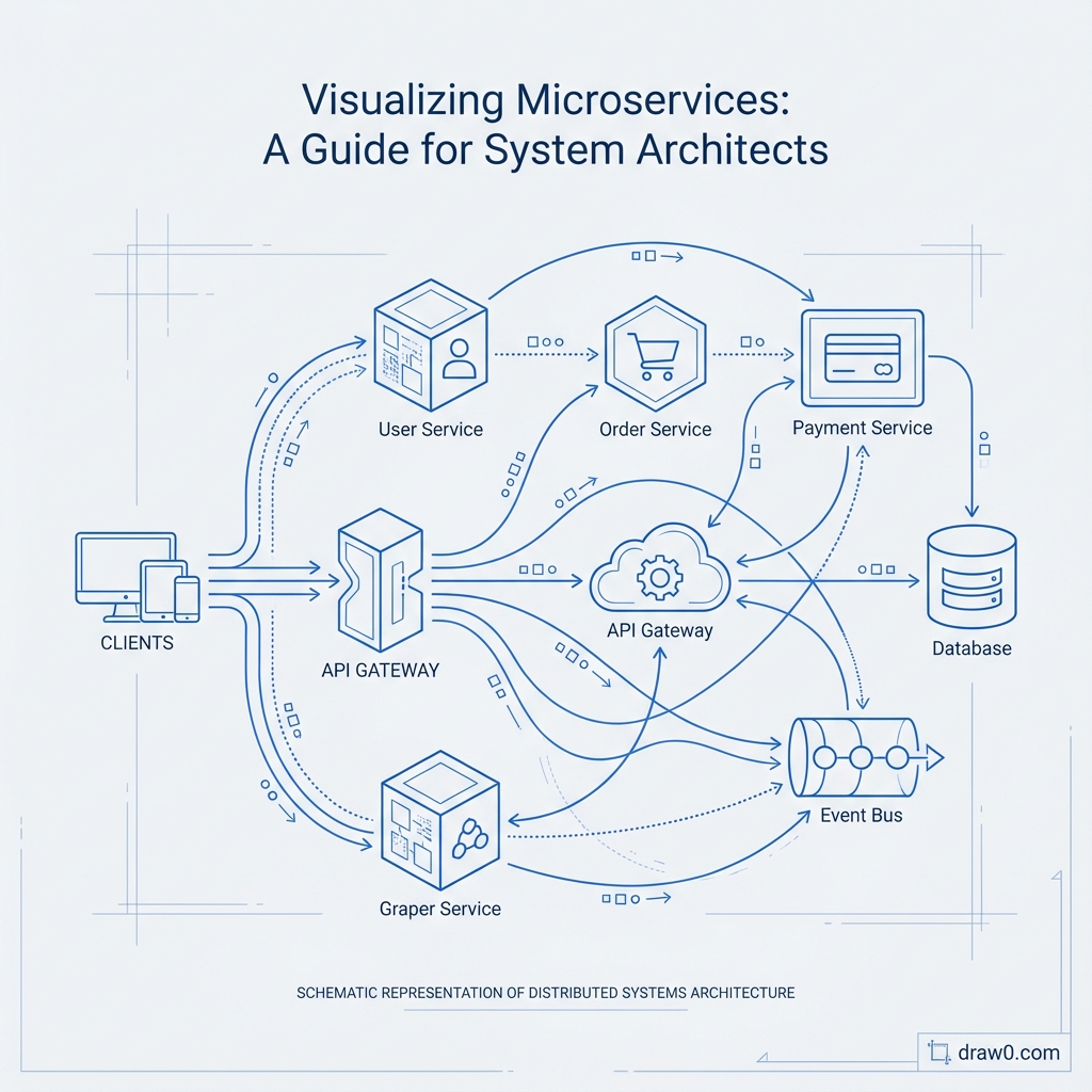
"Create a microservices architecture diagram: API Gateway routes requests to three services: User Service (PostgreSQL), Product Service (MongoDB), and Order Service (PostgreSQL). Order Service calls User Service to validate users and Product Service to check inventory. Order Service publishes events to Kafka. Notification Service consumes Kafka events and sends emails via SendGrid."
What Draw0 Generates
From this description, Draw0 creates a complete architecture diagram showing:
- Service components: Represented as distinct boxes with clear labels
- Data stores: PostgreSQL and MongoDB instances with database cylinder icons
- Message broker: Kafka shown as a messaging component
- External services: SendGrid displayed as external dependency
- Communication flows: Arrows showing sync (HTTP) and async (Kafka) interactions
- Labels on connections: "REST API", "Kafka events", "Email API" for clarity
Iterative Refinement
Add complexity through conversation:
- "Add Redis cache between API Gateway and services"
- "Show that Product Service also uses Elasticsearch for search"
- "Add Authentication Service that API Gateway calls before routing"
- "Include the monitoring stack: Prometheus scrapes metrics, Grafana visualizes"
Each addition updates the diagram automatically while maintaining layout and clarity.
Example: Mapping a Load Balancer, App Servers, and Redis Cache
Let's visualize a complete deployment architecture:
"Show our production infrastructure: Internet traffic hits AWS ALB (Application Load Balancer). ALB distributes to 3 EC2 instances running our Node.js API servers. Each API server connects to Redis cluster (3 nodes) for caching and session storage. API servers connect to RDS PostgreSQL primary with 2 read replicas. API servers also connect to S3 for file storage. CloudWatch monitors everything."
Infrastructure Diagram Output
Draw0 generates a layered architecture showing:
- Edge layer: Internet cloud → AWS ALB
- Application layer: 3 EC2 instances (App Server 1, 2, 3)
- Cache layer: Redis cluster with 3 nodes
- Database layer: RDS Primary + 2 Read Replicas
- Storage layer: S3 bucket
- Monitoring layer: CloudWatch connected to all components
Arrows indicate:
- Load balancing from ALB to app servers
- Cache queries (red for writes, green for reads)
- DB connections (writes to primary, reads from replicas)
- File uploads/downloads to S3
- Metrics collection to CloudWatch
Adding Security Boundaries
"Show VPC boundaries: ALB in public subnet, app servers and Redis in private subnet, RDS in isolated database subnet. Add security groups controlling traffic between layers."
Draw0 adds visual groupings (dashed boxes) representing network boundaries and annotates security rules.
Keeping Architectural Diagrams in Sync with Mermaid Exports
The secret to maintained documentation is treating diagrams as code:
1. Export to Mermaid.js
Draw0 exports your architecture as Mermaid code:
graph LR
  Internet[Internet]
  ALB[AWS ALB]
  App1[API Server 1]
  App2[API Server 2]
  Redis[(Redis Cluster)]
  DB[(RDS PostgreSQL)]

  Internet --> ALB
  ALB --> App1
  ALB --> App2
  App1 --> Redis
  App2 --> Redis
  App1 --> DB
  App2 --> DB
2. Store in Version Control
Save this Mermaid code in your repository:
docs/architecture/production-infrastructure.mmddocs/architecture/microservices-overview.mmddocs/architecture/data-flow.mmd
3. Render in Documentation
Embed directly in:
- GitHub/GitLab: README.md files render Mermaid automatically
- Notion: Code blocks with Mermaid syntax
- Confluence: Mermaid plugin renders diagrams
- MDX/Docusaurus: Native Mermaid support
4. Update Through Pull Requests
When architecture changes:
- Describe the change to Draw0: "Add Payment Service between Order Service and external Stripe API"
- Export updated Mermaid code
- Commit to repository
- Create PR with architecture change alongside code changes
- Team reviews both code and architectural impact together
This ensures diagrams evolve with code, not as an afterthought.
Best Practices for Microservices Diagrams
- Layer your diagrams: Create separate views for logical architecture, deployment, and data flow
- Use color coding: Different colors for sync vs async, read vs write, internal vs external
- Show data patterns: Indicate which services are write-heavy, read-heavy, or cache-friendly
- Include failure modes: Document circuit breakers, fallbacks, and retry logic
- Annotate latency: Show expected response times for service calls
- Indicate ownership: Label which team owns each service
Advanced Visualization Techniques
Service Dependency Graph
Generate a graph showing only service-to-service calls, useful for:
- Identifying circular dependencies
- Finding tightly coupled services
- Spotting single points of failure
- Planning service migrations
Data Flow Diagram
Show how data moves through the system:
- User uploads → S3 → Processing Queue → Image Service → CDN
- Order created → Order Service → Inventory Service → Kafka → Warehouse Service
- Analytics events → API → Kafka → Stream Processor → Data Warehouse
Deployment Pipeline Visualization
Map your CI/CD flow:
- Git push → GitHub Actions → Docker build → ECR → Kubernetes deployment
- Staging tests → Manual approval → Production deployment → Monitoring
Automation and Living Documentation
The future of microservices documentation is automated:
Service Discovery Integration
Tools like Consul, Kubernetes service mesh, and AWS Cloud Map already know your service topology. Emerging tools can:
- Auto-generate diagrams from service registry
- Update diagrams when new services deploy
- Alert when dependencies change
Traffic Pattern Visualization
Combine with APM tools (Datadog, New Relic) to show:
- Actual request volumes on each connection
- Error rates between services
- Latency heatmaps
Cost Attribution
Overlay cloud costs on architecture diagrams:
- Identify expensive data transfer between regions
- Spot over-provisioned services
- Visualize cost per request flow
Get Started with Microservices Visualization
Ready to bring clarity to your microservices chaos? Try Draw0's AI-powered architecture diagram generator. Describe your services and their interactions in plain language, and watch as AI creates comprehensive architecture diagrams showing service dependencies, data flows, and infrastructure components.
Export to Mermaid.js for version-controlled documentation that evolves with your system. Whether you're onboarding new engineers, planning migrations, debugging production issues, or conducting architecture reviews, clear microservices visualization is your foundation for reliable, scalable systems.